The Easel

24th May 2022

Cornelia Parker exposes the hidden meanings of everyday objects

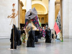
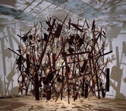
Parker, a conceptual artist, is nothing if not resourceful. One work comprises the fragments of a garden shed, reassembled after being blown up by the military. There’s silverware flattened by a steamroller. A tapestry made in part by lawyers and criminals. These are objects each of which has a back story that changes their meaning. Parker describes it as “sympathetic magic”. The reviewer says its “a kind of alchemy, turning mundanity into profundity”.

Seen as They Are

Paul, a British portraitist, discusses the genre. “Rembrandt depicts himself in old age as he is—the squashy nose and sagging jowls—but it is clear that he accepts himself. Lucian’s [Freud] and Rodin’s main subject is ‘flesh’ [but their] emotion is sometimes overblown and theatrical. Old age has always been my subject matter. I often think of those old women [subjects]… and I wonder at their inner reserves … riven as they all must be by memories and fear of the approaching dark.”

‘It’s worse than the USSR’: how the censors returned to Russian art

It seems like there is a slowly unfolding crisis in Moscow’s contemporary art world. Until recently a booming sector with new world-class museums, the start of the war with Ukraine has marked “another age”. Censorship measures have emerged along with pressures to be “patriotic”. As a result, some institutions have lost staff and cancelled exhibitions. Says one uncertain artist “There could be a creative explosion like in the 1920s … or we could be heading into a swamp.”

Gainsborough’s ‘Blue Boy’

When Gainsborough painted this famous work, the “fancy picture” was fashionable. These were pictures intended for public viewing, sentimental and often featuring children. Blue Boy was intended as one of these but isn’t entirely successful. It is “rather brown” which, in reproductions, makes the blue stand out. This masks the “shortcomings of [Gainsborough’s] colour management … the fabric never really shines, it just tells us it does.”

Breyer P-Orridge

A New York show highlights the body modification art of Breyer P-Orridge. Two artists who shared an enthusiasm for pandrogyny (total equality, oneness), their art was to merge their distinct selves into a single presence. Matching plastic surgery was frequent, reflecting a view that bodies are but “cheap suitcases”, destined to become obsolete. Breyer P-Orridge’s view was that “difference is the core problem”. A startled reviewer responds, “the self is … where the potential of intimacy lies.”

Architecture or Jewelry? Josef Hoffmann’s Modern Brooches

The Vienna Werkstätte was dedicated to the decorative arts. Led by Hoffmann, a pioneering modernist architect, it aspired to create gesamtkunstwerk a ‘total work of art’. His jewellery combined Japanese “vegetal patterns” with a modern geometric aesthetic, seemingly contradictory elements that yielded designs “monumental in their minimalized architectural forms”. They anticipated both art deco and the later International Style. Images of other Hoffmann designs are here.

Radical Landscapes review – ‘Is loving green fields really wicked?’

The Brits love their damp landscape. A show suggests that traditional “conservative” landscapes – think Constable – are better represented as places of “trespass, land use and the climate emergency”. Why make this the predominant way to view the great outdoors?  “Love of landscape not only has radical and conservative sides but they coexist in the same work of art, the same experience of nature. If loving green fields is wicked, why go there?”

17th May 2022

Bringing The Procession to life

London’s Tate – founded on a Caribbean sugar fortune – must have seen this coming when awarding its annual installation commission to Locke, an artist of Caribbean heritage. Locke’s vast, “extraordinary” work contains over 100 cardboard and fabric figures, arranged in a flamboyant procession. A more careful look reveals colonialist icons and symbols everywhere, giving the colourful work a slightly sinister edge. “It’s about history, but it’s about sugar, you’re dealing with Tate, you have to deal with that.

Matthew Wong’s life in light and shadow

Wong, a Canadian artist, died young after an art career marked by “a furious outpouring” of work and disrupted by mental illness. His artistic development was lived out on social media and reveals how he came to make works of “astonishing lyricism, melancholy, whimsy, intelligence, and, perhaps most important, sincerity”.  He was, says one critic, “a genius from nowhere.” A shorter piece focused on a current exhibition is here.

The vibrating beingness of Seurat’s pointillist paintings

Seurat thought colourful Impressionism needed the discipline of the Old Masters. His remedy was pointillism – painting with meticulously applied dots of “simultaneously contrasting” colours. This technique “aims to deconstruct the act of seeing … Something about Seurat’s work just pulls you in. The mind wants patterns in the same way that the eye wants colours to merge. We want definition and borders. But sometimes, no matter how hard we try to keep it together, we cannot.”

Dissident artist Alexander Archipenko rediscovered in the Estorick Collection

Paris in 1910 was a magnet for modernist artists, among them the eastern European sculptors Brancusi and Kyiv-born Archipenko. Rejecting Rodin as “outdated”, Archipenko used the new ideas of cubism to create elegant, radical biomorphic forms. Italian Futurists loved his “optimistic sculptures of a Brave New World” and their advocacy only increased his influence. All this caught the eye of an unknown Giacometti, who moved to Paris and, in 1925, rented Archipenko’s former studio.

Swirls of flesh: Dorothea Tanning at Kasmin Gallery

A recent biography of Tanning claimed that she occupies “a singular position in the history of modern art”. Some reviews of her current show in New York are similarly enthusiastic. But not all. The linked piece suggests that her early Surrealist works overstate her whole of career achievement. “On the whole, her efforts amount to overtures more than full symphonies”. And what’s the problem with that? “Great becomes meaningless when nothing can be merely good.”

Why it took us thousands of years to see the colour violet

The colour violet, it seems, carries a mystery. An analysis of 14 large art museums reveals that, before the 1860’s, less than 4% of paintings used violet. For the rest of the 19th century, it appears in 37% of paintings and, in twentieth century paintings, 43%. The explanation offered is, in part, that violet rarely appears in nature.  The Impressionists, looking for colours to contrast with the yellow sunshine they loved to paint, discovered that violet worked well. “Violettomania” howled the critics.