Tickled Pink, Green with Envy, I’ve Got the Blues: Our Non-logical World of Colour
David Kastan is the George Bodman Professor of English at Yale University (as well as being an Easel subscriber!). Earlier this year he co-authored the book On Color with the English painter Stephen Farthing. Morgan Meis recently talked to David about the book and his interest in color more broadly.
Morgan Meis: David, we are going to discuss your book, On Color. It came out a couple of months ago and the publisher’s blurb says that, although we don’t understand color very well, it nonetheless “shapes our social and moral imagination”. Your day job at Yale is in the English Department, where you specialize in Renaissance literature, and Shakespeare in particular. What was it that prompted you to write such a book?
David Kastan: Well, after a wonderful boozy dinner with some friends in London, I got into a conversation with Stephen Farthing, who is an English painter and academic. We were talking about how there are many more colors that can be distinguished than there are words to name them, and that even if two people use the same word to name a color, we don’t really know if they are seeing the same color. I suddenly thought about a line in Shakespeare’s The Tempest, where Sycorax, a witch and mother of Caliban, is described as a “blue-eyed hag.” Shakespeare says she came from Algiers, where almost no one has blue eyes. Some scholars say that maybe this refers to her having blue colored veins in her lids, and others say that Elizabethan English often made no distinction between blue eyes and gray eyes. To me, it always seemed as if the phrase meant exactly what it said—but editors and annotators seemed to have trouble allowing Shakespeare’s North African witch to have the blue eyes that so many English people have. So we were off and running, thinking about the colors we see, the names we attach to them, and the meanings that they take on.
This got me thinking more deeply about the importance of color and reminded me of a quote from Cezanne that I really love. He said color is a collaboration between the mind and the world. So we thought about writing something together: a collaboration between an artist who likes language and literary scholar who likes color. I ended up doing the writing, but the book began in our conversations and was sustained by them throughout.
Morgan Meis: How did you decide about the structure of the book?
David Kastan: Ugh – with a lot of difficulty. I started writing it more or less thematically: how does color vision work? What determines color spaces? Where do our color names come from? How do color symbols get established and used? Etc. And then the “duh” moment came, when I realized that a book on color should be organized by colors. So I destroyed the first draft and wrote this book in its place. With this book, I gave up on the idea that I could “explain” color or treat it in any systematic way. Instead, I surrendered myself to color, as it were. I tried to let myself be guided by how color actually works in our world, how it shapes and is shaped by culture. I abandoned a certain amount of intellectual control and with that my excitement about color was allowed to go wherever it needed to go. For this reason, I had a lot of fun writing this book, which I hope comes through in the final product.
Morgan Meis: You organized the book by the specific colors of the rainbow, plus chapters on black, white and grey, starting off with red.
David Kastan: I knew that somewhere I needed to say something about what colors are and how we see them and figured that logically that’s the place a book on color should begin —though nothing about color is logical. So yes, I start the book by discussing the neurobiology of color vision and some of the more abstract thinking about what philosophers would call color “ontology.” To me the most interesting thing came when I read about pigeons’ color vision, which is more refined than ours is! They have four or five sets of cones (color photoreceptors) in the retina whereas humans have only three. We think that we see color “normally” (unless we are colorblind), but in reality pigeons see color much better. They see colors we can’t see and see colors we do see differently. In fact, normally sighted people are in the exact relation to pigeons as colorblind people are to the normally sighted. As I say in the book, we might think we see red, but “a pigeon would laugh at us if it could”!
But we’re the ones who get to define what colors are, because we have a color language. Lots of living creatures see colors, but there is no reason to think that they ever think about color as an abstract, conceptual category. The ability to discriminate colors matters, of course: a red bug might be delicious, while a blue bug might be poisonous. But there is no particular evolutionary advantage for most species to conceptualize the distinction as “color.”
Morgan Meis: Right, and that’s what we do. We are a conceptualizing animal, and once color is conceptualized, I suppose, we can then use it in a whole other variety of ways that are only partly visual.
David Kastan: I think that is right. When I think about the book it seems to me it is about how we make color—it doesn’t exactly exist on its own out there in the world; and color makes us. We color-code race, gender, social class, etc. with colors, but in all of this there is so much more than what meets the eye.
Morgan Meis: Ok; but it is interesting that even when color is coded it is still unstable. Color is unstable visually (pigments fade and in a dark room the color in fact goes away) and also metaphorically.
David Kastan: That’s a nice way to think about it. Lots of living creatures see colors, but there is no reason to think that they ever think about color as an abstract, conceptual category.
Morgan Meis: So we are pretty far from Shakespeare.
David Kastan: Yep. We are! And that was in large part what made writing this book so thrilling—or scary. It was the high-wire act of being so far out of my comfort zone. In my day job as an English professor, I write about Shakespeare as an “expert,” and write mainly for other experts, who tend to be interested in my work mainly in so far as they can say I am wrong. But with color, there is a wonderful democracy of color experiences—and it isn’t even clear what being right about something would mean. People tell me often they love Shakespeare but are reluctant to tell me their ideas about his plays. Me being the blah, blah Professor of English at Yale makes them self-conscious. But everyone has color experiences, and knows things about color words in different languages, and seems eager to talk about them.
Morgan Meis: No one can really claim authority when it comes to color, can they? … Not even the scientists.
David Kastan: That’s right, they don’t. And this gets us to one of the central ideas of the book, namely the instability, multiplicity, and inadequacy of many of our ideas about color. In that sense it is a weird book. (Maybe not just in that sense!) How should it be classified in a bookstore or library? Should the book be reviewed by art historians or philosophers or psychologists. It keeps coming back to race and racial prejudice, so should it be reviewed by political scientists? It’s inter-disciplinary but maybe more, counter-disciplinary. Our academic disciplines, which are mostly inherited from 18th century German universities, are not well suited to thinking about this topic (and many others).
Morgan Meis: So, you need to be able to think in many different registers when talking about color. And be “fluent” in various disciplinary languages.
David Kastan: Or at least be willing to say something. Take the color orange, which brought me to think about color language. All modern languages use a set of “focalizing” words like red, blue or yellow to organize their color sense. But sitting underneath each of these “basic” color names is a whole family of shades and tints. Imagine asking which of the shades of blue (for example) is the “real” blue. That seems the wrong question. But perhaps orange is the exception. Orange is more or less just orange, while there isn’t something that is just blue. In European languages the word “orange” didn’t exist before we knew of oranges. This seems counter intuitive. But it is true.
Morgan Meis: So there was no word “orange” before there were oranges?
David Kastan: Right. Chaucer, for instance, talks about a fox being “betwixt the color of yellow and red.” He doesn’t say the fox is orange, because there wasn’t yet a word for the color. Slowly orange as a color name shows up in English. At the end of the 16th century Shakespeare uses the word as an adjective – “orange tawny,” but the only time he uses “orange” alone is to name the fruit. The fruit comes before the color.
You can actually follow the trade routes as oranges reach Europe from the Indies in the history of the word in various languages . Orange originally comes from a Sanskrit word for the orange blossom: naranga. Along with the fruit, the word migrated into Persian and Arabic. From there it was adopted into European languages, as with narancs in Hungarian or the Spanish naranja. But by the seventeenth century, “orange” became an English color word, and it was possible (though wrong) to think the fruit was called an orange because that was what color it was.
Morgan Meis: So in each chapter you are pulling on some kind of thread, something about each specific color that tells a bigger story? An idea gets located in a color. Yellow, for instance, seems to be the chapter where you go at race full tilt.
David Kastan: Yes. We attach colors to mark different races even though no one is the color that we designate the race with. You have 500 to 600 years of European contact – from Marco Polo on – where East Asians are never described as being yellow. Inevitably European travelers describe them as “white like us.” Then, all of a sudden, we get to the point where the Encyclopedia Britannica in 1911 says that people in China are predominantly yellow. Obviously this is tied to 19th century European and American anxieties about the rise of China and Japan – both military and economic anxieties. Kaiser Wilhelm was one of the first to popularize the term “yellow peril”. But the yellow that was seen was more a function of prejudice than pigmentation.
These racial codes played out in all sorts of ways. One way it was expressed was in Crayola colors. The first box of Crayola crayons, released in 1903, had a crayon called “Flesh Tint”. In 1949 they changed it to just “Flesh,” but of course it’s that pinky color that passes for Caucasian coloring. In 1962, with the rise of the Civil Rights movement, they realized this isn’t the color of flesh, it’s just Caucasian flesh, so they changed the name again, to “Peach”. Much later they even changed the name of the color “Indian Red” to “Chestnut,” though “Indian” didn’t refer to Native Americans but to the country of origin. But I guess they thought you can’t be too careful.
Morgan Meis: Let’s move on to another color. Pick one.
David Kastan: Okay, how about green? It’s the color of ecological parties. As I say in the book “Once Martians were green; now it’s earthlings who are green, trying to save the planet”. Why do colors get used in a political context? Obviously, it’s partly that they are recognizable and memorable. And adaptable – colors don’t mean anything at all in themselves, of course, but we can make them mean things. Green doesn’t have to be the color of ecology – given the size of the oceans it should probably be blue. Earth seems a weird name for our planet: it should be Ocean. And there are non-ecological parties that use green.
Or think about red states and blue states in the US – how did that happen? As far as I can tell it emerged only in 2000. And has its origins in coverage after color TV was introduced. Originally it was impossible to make one party “red” in Cold War America. So the TV stations would switch the color-coding on the electoral maps in each election cycle. In 1980 the Republicans were the “blue” party, and the Reagan majority on the electoral map was described as an “ocean of blue.” But in 2000, the disputed election between Bush and Gore carried on for 36 days until the Supreme Court finally decided to end the recount. Every night people had watched the news waiting to see what would happen, and when Florida finally was declared to be “a red state,” Bush was elected president. Night after night of television coverage had fixed our political colors in the national imagination: red for Republicans and blue for Democrats. What was once discretionary and variable became a seemingly permanent feature of our country’s political imagery, signaling our ideological divide.
Morgan Meis: Yes, this fits nicely into your theme about the stability and instability of color – the use of colors flips around all the time, yet at the same time you can’t imagine politics without color. You cannot imagine flags, you cannot imagine national identities, without color. So it’s both arbitrary and necessary at the same time.
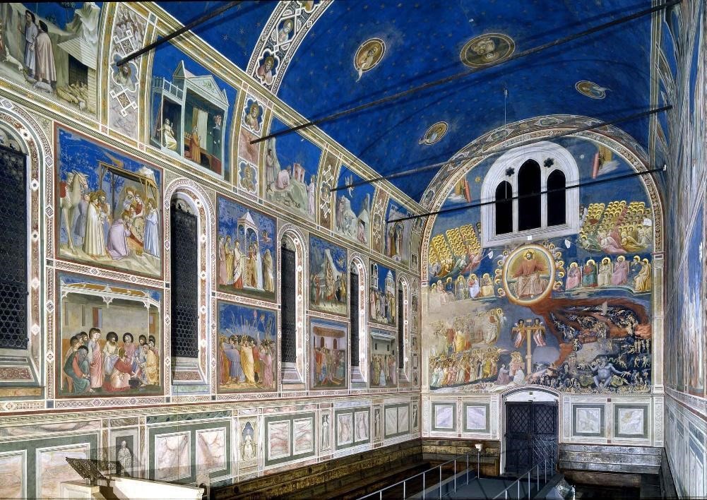
David Kastan: That’s true. And true in other arenas also. There’s a chapter called “Moody Blues” in the book, about color and emotions. People have the blues, they sing the blues. Blue is the color of dejection, of depression. And yet blue is also the color of transcendence, as in the Giotto chapel in Padua. This contradiction is so deep. It is unresolvable. There’s a blue of sadness and a blue of bliss.
I love the line in an essay of yours, Morgan, where you say mood is the color of consciousness. It is a reminder that we color code lots of emotions – we are tickled pink, green with envy, red with anger; we have black moods, rosy temperaments, and yellow streaks. Or at least we do in English. These assignments are not stable from language to language. In Hungarian you are yellow with envy and green with anger – sounds like everyone is turned into the Incredible Hulk!
Morgan Meis: Why did you end the book with colors that people don’t even always think of as colors: black, white, and gray?
David Kastan: Well, I wanted to do the achromatic scale, which is another way to think about color, separate from the Newtonian spectrum. Newton gives us only one way to think about color with his seven constituent colors of “white” light. But it is worth reminding ourselves that Newton was never quite sure if there really were seven colors in the rainbow. Sometimes he thought there were five; at other times he thought there were eleven. He eventually settled on seven because there are seven notes in the diatonic scale, and perhaps because the world was created in seven days. For him it was more a matter of faith than of fact.
Morgan Meis: So black, white, and gray aren’t really colors for Newton. At least they don’t fit into his theory.
David Kastan: Yes, so it seemed worth thinking about them. Grey was my last chapter because in a way it brought me back to the beginning. Black and white photography, TV, and cinema is really all grayscale, and yet, for so long, was able to stand in for all the other colors. Louis Daguerre (who invented one of the earliest photography processes) said in the 1830’s that photography allows for “the perfect image of nature.” That’s what a lot of people said about early photography, but seems so very weird – how come that perfection didn’t involve color? This wasn’t just a technological limitation. For a long time, even after a stable color film was available, there was still a belief that serious photography should be in black and white. Cartier-Bresson apparently once said to William Eggleston, who was shooting in color: “you know, William, color is bullshit.” At some level there was this thinking that color just wasn’t essential—or worse. David Batchelor has written so well on this — what he calls color-phobia, the sense that color is secondary, decorative, dangerous, seductive.
When I first was working on the book a friend introduced me to Pete Turner, one of the great color photographers (and whose wonderful photo is on the cover of the book and to whom the book is dedicated). I asked him why, when “serious” photographers were almost all working in black and white, he was working in highly saturated color. He said, with a few expletives, “The world is in color. A good photographer should remind us of that.”
MM: And yet we often seem to experience memories and dreams in greyscale. It this why we took black and white photography so seriously, that it’s associated with memories? Or, is it the other way around?
David Kastan: I think it’s mainly the other way around. Once color images became the default condition of photography, black and white becomes the color of the past. The wonderful photos of Dorothea Lange during the Depression were all black and white. Now, compare them with Doug Kuntz’s pictures of migrants coming over to the Greek isle of Lesbos from Turkey. They are similar photos in structure but they are in color, and the comparison with Lange’s photos reminded me of a phrase you used, Morgan, in your essay about monuments, that they allow us to start forgetting – they allow the past to be past. That has happened with black and white photographs; those images have now been safely sequestered in the past. There is no political action that can be contingent on them, unlike the Lesbos photographs, which are clearly agitating for reform in the present.
Remember the Paul Simon song Kodachrome? When he first wrote it, in the 1970’s, one of the lines goes “and everything looks worse in black and white”. He was excited about the Kodachrome product. Some years later he did a big concert in Central Park (1982, I think) and, unconsciously or not, changed the line so it goes “and everything seems better in black and white”. In those 10 years or so, black and white became safe and reassuring.
MM: Well, that’s an appropriately colorful anecdote on which to finish the conversation. Thank you for your time.
DK: You are most welcome!