Käthe Kollwitz’s kitsch
Betroffenheitskitsch. It is not an easy word to say. That’s because it is German and Germans love to make compound words. The core of the word is the adjective betroffen, which means ‘affected’, but also ‘concerned’, and even ‘shocked’ or ‘stricken’. Betroffenheit is the noun and can be translated as ‘shock’, ‘consternation’, ‘concern’. Finally, we add the word kitsch, which makes the whole thing, well, kitschy. Betroffenheitskitsch is shock or deep concern that has been taken to the level of kitsch.
I bring this up in reference to the art of Käthe Kollwitz (1867 – 1945), the great German printmaker (she also painted and made sculptures) of the late 19th and early 20th centuries. There is, indeed, quite a lot of Betroffenheit in the work of Kollwitz. In fact, it is almost all Betroffenheit. Take, for instance, a work like The Widow II (1922). The image is woodcut on paper. It has all the strong lines and simple composition one expects from a woodcut. It is from the War series that Kollwitz produced several years after the end of WWI. Kollwitz’s own son, Peter, was killed in the war, and Kollwitz produced this series partly in response to her own grief.
Käthe Kollwitz, The Widow II (1922)
It is not clear if the widow is dead in this picture, or, for that matter, the child. Perhaps they are both overcome with the grief and suffering that they’ve endured. The contortion of the widow’s body and the way that her head pushes up from the floor suggest to me that she is still alive, but rigid with emotional distress. Her toes, splayed out and corpse-like at the edge of the print, are especially disturbing. And yet, at the same time, her hands are tender and still soft as they cradle the baby collapsed upon her breast. That blend of hard and soft, simple lines conveying complex emotions, along with deep pools of pure black in the composition, are all signature techniques in the work of Kollwitz. She was a master printmaker, of that there is no doubt.
The question of Betroffenheitskitsch is a little harder to address. Is there something kitschy about this print in the way that it so forthrightly and sincerely exposes the emotional suffering of the woman laying on the ground with her child? Is it somehow corny? Is there something embarrassing about it, even? This is what some contemporary German artists and art critics have said in recent decades. In a piece for Artnet, for instance, Kito Nedo noted that, “According to Yury and Sonya Winterberg, authors of a Kollwitz biography (Bertelsmann, 2015), the slogan ‘No more war, no more Kollwitz!’ has been making the rounds at German art colleges for decades.” Gerry Walker, in a piece for Irish Arts Review, wrote that, “In Germany it was suggested that a form of ‘Kollwitz fatigue‘ had set in by the 1970s. Certainly Berlin and Dresden are very Kollwitz–aware and her subject matter still remains deeply challenging for some German sensibilities.”
Kollwitz was, it should be said, completely unapologetic about her choice of subject matter and the style with which she delivered her images. She was raised in a household with a strongly Socialist father and a reformist mother. Her interest in working people and the struggles of everyday folk was more or less congenital. She once said, “My real motive for choosing my subjects almost exclusively from the life of the workers was that only such subjects gave me, in a simple and unqualified way, what I felt to be beautiful.” Kollwitz was especially interested in creating images of working class women, saying, “The working class woman shows me her hands, her feet and her hair. She lets me see the shape and form of her body through her clothes. She presents herself and the expression of her feelings openly, without disguises.”
It’s notable that while Kollwitz did paint sometimes, she never really had a feel for color. This was something she herself recognized. As shown in the above quote, Kollwitz was more interested in simplicity, the basic clarity of black and white, the truth of line. She was drawn primarily to printmaking because printmaking lends itself to this graphic clarity.

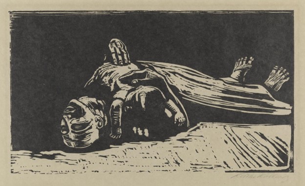
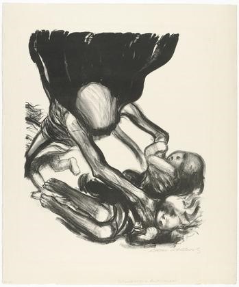
Käthe Kollwitz, Death Holding a Woman on his Lap (1921)
Take, for instance, a work like Death Holding a Woman on his Lap (1921). A large portion of the surface area of the work is simply positive or negative space, black or white. The lines defining the forms of both Death and the Woman are simple and spare. The few lines in the background outlining a kind of horizon are enough to give the print a great and even foreboding sense of space and depth. And notice the tiny foot of the woman draped over the leg of Death contrasted with the massive and terrifying hand of Death cradling the woman. Like all the great printmakers, Kollwitz had an incredible talent for showing much with little. One could easily compare this woodcut with the great works of Holbein and Dürer. And yet there’s a difficult-to-describe feeling of Modernity in the print as well. Maybe it is something in the schlumpy casualness in which the figures huddle into one another. Figures in Dürer prints have a more studied rigidity. Even in the wildest of Holbein’s Danse Macabre prints you’d be hard pressed to find two figures melding into one another as deeply as they do in Kollwitz’s Death Holding a Woman in his Lap.
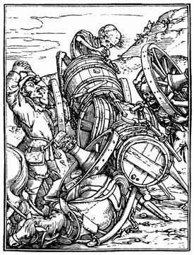
Hans Holbein, Danse Macabre (1523-5)
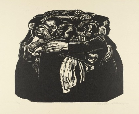
This melding of forms was one of Kollwitz’s favorite techniques. She liked to show two or more people huddled together in such a way that it becomes hard to distinguish exactly where the bodies are separated. You can see this quite clearly in one of her most famous images, another woodcut from the War series. This one is known simply as The Mothers.
Kathe Kollwitz The Mothers (1921-2)
This huddled mass of mothers is, in essence, one giant mother-beast with many heads and various encircling arms. Even when Kollwitz was working in media other than woodblock she was interested in the merging of bodies and the ways that groups of people, large or small, tend to become a mass. Look at a print from her Peasant War series, for instance.
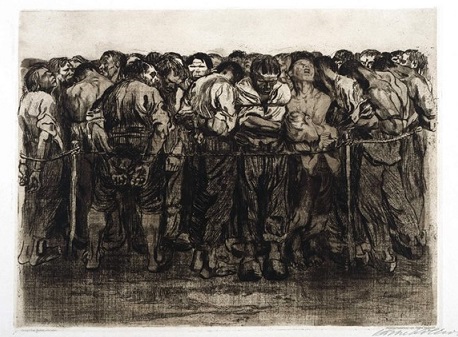
Käthe Kollwitz, The Prisoners (1908)
The Prisoners is made with an etching technique called drypoint where you take a really sharp object and cut lines into a copper plate (or some other hard surface). The hardness of the cutting device and the surface makes for finer lines and greater detail as compared to woodblock printing. This becomes obvious when contrasting a print like The Prisoners with The Mothers. We get a good deal more individual differentiation in The Prisoners. The largish man toward the left side of the print with his back to us and his head turned to the right is especially distinct. His strength and his anger are palpable, as are the solidity of his wide stance and the power of his calf muscles, clearly visible beneath the rolled-up legs of his pants.
At the same time, this mass of prisoners merges into something indistinct and indefinable in its particulars, especially as one looks past the figures in the immediate foreground, and into the many heads and body parts behind them. Or look at the figure to the right side of the print, slightly off-colored in comparison to his immediate neighbors, his head turned upward and mouth open in some kind of cry or grimace. This figure begins to blur into the figure directly behind him and to his left, as well as a boy, also in distress, directly beneath him. The greater the emotional distress, Kollwitz seems to be showing us, the more the boundaries of the individual are broken down.
The Prisoners is part of a print series that Kollwitz made about Germany’s Peasant War. This was a widespread revolt against nobles and landlords that spread across areas of what we now call Germany in the mid-16th century. The revolt was stimulated by The Reformation but ultimately crushed, with Martin Luther’s encouragement, by the combined might of local princes and government military forces. Upwards of 300,000 peasants and farmers are thought to have been killed in the suppression of the revolt. Kollwitz’s print series was a kind of tribute to all the common and generally anonymous people who fought, suffered, and died during the Peasant War, as well as connecting those struggles to the ongoing woes of the working class up to her own day.
But most interesting about a print like The Prisoners—or another famous print from the series, The Outbreak, which shows an older woman in a long peasant dress egging on a group of variously armed peasants and farmers as they rush down a hill toward some unseen enemy—is the way Kollwitz was able to portray extreme human emotions with such direct visceral impact.
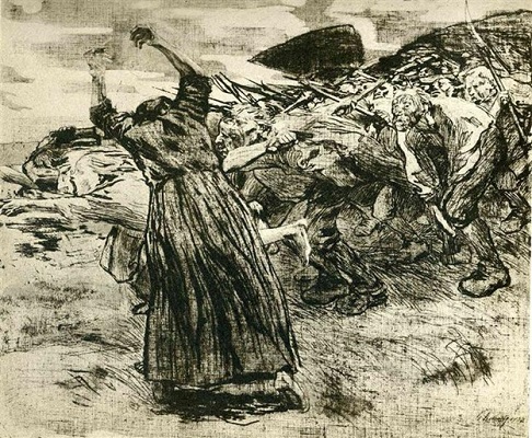
Käthe Kollwitz, The Outbreak (1906)
The degree to which this mass of rushing humanity has, in its rage and excitement, lost some of its individual identity is obvious to see. This loss is at the core, I believe, of what has led some of Kollwitz’s more recent critics to accuse her of Betroffenheitskitsch. That’s to say, something in Kollwitz’s work makes people uncomfortable, even perhaps slightly afraid. That much direct emotion can be destabilizing. Literally, as Kollwitz suggests in her graphic work, the selves who are overwhelmed by grief and anger and pain in her pictures have lost all sense of stability. They aren’t really even individuals anymore. Their boundaries have become porous and their shapes merge with other shapes on the page. This raw expression of emotion and threat to the integrity of the individual creates a potential resistance to Kollwitz’s images. This resistance is especially acute amongst German artists and critics receiving her work in the latter part of the 20th century and early part of the 21st.
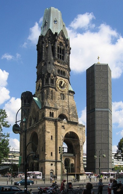
Spending time in Berlin can be helpful in understanding why this is the case. Berlin is a city that bears its historical scars openly and to an unusually extreme degree. Every city has its wounds, of course, every nation, every culture is shot through with tragedy and horror. But some places convey their suffering more directly than others. In Berlin, the trauma is especially fresh: the horrors and shame of WWI, followed by those of the Nazi era culminate in the Berlin Wall, the most visual symbol of the Cold War. It is impossible to walk around Berlin today without constantly confronting the ugliness of the Wall and the way it once ripped the city apart. Pieces of the Wall are still left standing here and there, smeared with graffiti new and old. The buildings of East Berlin, Soviet-era monstrosities still standing in Alexanderplatz and other squares, share the city with the shell of the Gedächtniskirche (Kaiser Wilhelm Memorial Church), its Rose window blasted open in 1943 by the bombings of WWII.
Gedächtniskirche (Kaiser Wilhelm Memorial Church), Berlin
And then there are the Stolpelsteine (stumbling stones), concrete cubes with brass surfaces inscribed with the names and dates of those persons, usually Jews, who were victims of Nazi extermination or persecution, placed in front of so many apartment buildings in Berlin. It is impossible to walk around Berlin for long without stumbling upon many Stolpersteine.
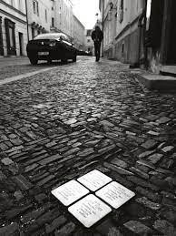
Stolpersteine, Berlin
I wonder sometimes, whenever I spend time in Berlin, whether it is only possible to live in the city by making oneself numb, at least to some degree, to the reminders of historical trauma, guilt, memory, and sorrow that assault one from every direction. I don’t want to suggest that this problem is unique to Germany, or that the horrors of German 20th century history are any different, qualitatively, than similar horrors embedded in, say, American or Australian or Cambodian history. But we are speaking now of Germany and of the challenges in making art that confronts its history. And from this perspective, one can begin to see what is so unsettling about Kollwitz’s pictures. Her pictures—with their suffering subjects smashed against and poured over one another—seem to deny that one could, or should, get any distance from the emotional impact of traumatic experiences. The pictures cry and scream and wail with no relent and no apology. The subjects in her prints lose themselves, literally and figuratively, in the degree to which they are broken down and dissolved by their suffering. Her pictures are unvarnished emotional realism. Here is a person who suffers. You, the viewer, must confront this suffering and, to some degree, share it.
I will never forget the experience of taking my father to visit the Käthe Kollwitz Museum in Berlin. After taking in two floors of her work, it was too much for him. On the third floor, he simply broke down and started crying. “Why did she do this?” he asked me through his tears. I think it might have been the lithograph Death Grabbing at a Group of Children that finally did him in.
Käthe Kollwitz, Death Grabbing at a Group of Children from the Death series (1934)
It is no great surprise then, that many German artists and critics would begin to shy away from the direct emotional appeal made by Kollwitz. Take, for instance, the work of Martin Kippenberger (1953 – 1997), the peripatetic and difficult-to-pin-down late 20th century artist/provocateur who created works like Feet First, and who generally took an ironic and comedic approach to art.
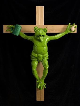
Martin Kippenberger, Feet First (1991)
Notice that the crucified frog has an egg in his left hand (the egg was something like Kippenberger’s personal symbol) and a beer stein in his right (Kippenberger would drink himself to death at the age of forty-four). This is a silly and outrageous work on the face of it, though it should be noted that it managed to anger Pope Benedict. Benedict was so annoyed by the crucified frog that he wrote a public letter in which he complained that the work, “injured the religious feeling of many people who see in the Cross the symbol of the love of God and of our salvation, which deserves recognition and religious devotion.”
I bring up Kippenberger for the specific reason that when he wasn’t offending Christians he may, as the aforementioned Kito Nedo has suggested, also have been satirizing Kollwitz (among others), especially in a series he made in the 1980’s and 90’s called Krieg Böse (War Wicked). One of those paintings depicts Santa Claus standing on the bow of a gunboat. Santa, I suppose, is doing his best to stop war. Or maybe he is just standing there. It’s unclear.
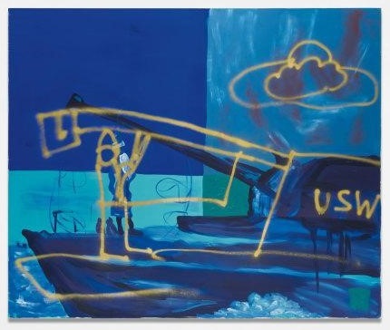
Martin Kippenberger, Untitled (from the series War Wicked/Krieg Böse) [1991]
What Kippenberger does make clear in his War Wicked series is that he had little patience for the tradition of earnest political painting, perhaps exemplified in Kollwitz’s famous anti-war poster Never Again War.
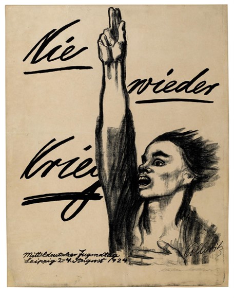
Käthe Kollwitz, Nie wieder Krieg (Never Again War) (1924)
Unable to get on board with any sort of propaganda, no matter how well-meaning, Kippenberger pokes and teases. He throws together symbols that are supposed to be meaningful until they become absurd. He makes kitsch images purposefully, so that he can never be accused of making them unintentionally. And that is maybe the crucial point. Kippenberger was deeply embarrassed of art, of himself, of his own desire to make anything that could be considered important. And yet he kept making art until almost the day he died. He produced a particularly striking series of self portraits toward the end of his life that seem to revel in himself as pathetic, unhealthy, drunk, dying.
Martin Kippenberger, Untitled (1988)
But the more I’ve looked at Kippenberger’s work over the years, the more I suspect that it has a Kollwitzian aspect after all. Even his earlier work can be seen as filled with far more unvarnished emotion than it seems at first glance. The difference between Kollwitz and Kippenberger is more a question of shame and exhaustion than anything else. Both artists are dealing with the problem of Betroffenheit. Kollwitz—who died five months before the end of World War II—attempted to run directly into and through Betroffenheit, to confront it head-on in pictures that are unashamed of their earnestness. Kippenberger, born in 1953, was of a generation that did not directly experience the horrors of the first half of the 20th century but could not escape them either. Though he preferred to run away, to avoid, to mock, Kippenberger was also quite aware that there was nowhere, really, to run, that his mockery was more often than not self-defeating. His life ended in a version of tragedy no less poignant, and therefore potentially kitschy, than a broken-down proletarian woman in one of Kollwitz’s pictures.
Which might seem to imply that Kollwitz gets the last laugh. Yet, I don’t think this gets it right either. I would prefer to laugh, and therefore to cry, with both of them. I can imagine a quite bewildering and powerful exhibit that presents alternating works of Kollwitz and Kippenberger. Kollwitz’s intense earnestness constantly offset by Kippenberger’s biting irony and vice versa. There is no one way to deal with the slings and arrows of outrageous fortune. Art needs them all.