Essay: Borromini – mystery man of the Baroque. Jed Perl and Deborah Rosenthal in conversation with Morgan Meis
The following is a discussion with Jed Perl and Deborah Rosenthal about a book they recently jointly produced called About Borromini. The book is published by MAB Books and is described thusly: “About Borromini unites two highly personal responses to the buildings of Francesco Borromini, the seventeenth-century Roman architect whose works are among the essential expressions of the Baroque imagination. During a stay some years ago at the American Academy in Rome, Deborah Rosenthal and Jed Perl were fascinated by this enigmatic architect and his paradoxical vision, by turns opulent, extravagant, saturnine, and austere. ‘I began a series of intaglio and linocut prints’, Rosenthal explains, ‘and these found a response in Jed’s texts – some of which are prose poems’. About Borromini is a dialogue between an artist and a writer – and a contemporary salute to an architect who died 350 years ago.”
Morgan Meis: Borromini is a name probably not immediately familiar to your average reader. Can we start with a brief explanation of who he was and why his work is of interest?
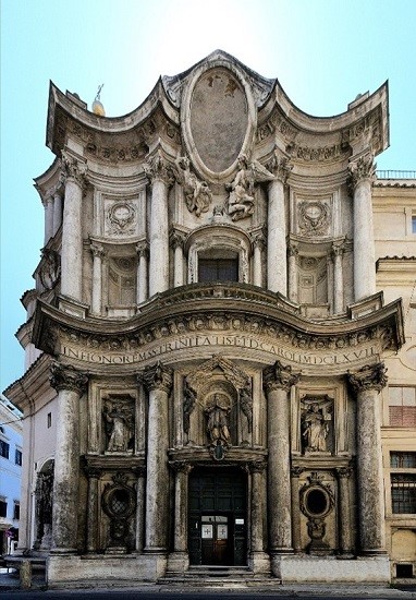
Jed Perl: Francesco Borromini is the mystery man of seventeenth-century Roman architecture. Both during his life and after his death – in 1667, possibly a suicide – this great architect was often overshadowed by another artist, Gian Lorenzo Bernini, who was not only a great architect but also a transcendent sculptor and a painter of consequence. Bernini’s Rome is all about grand gestures, crowds, spectacles — a place to see and be seen. He did much to shape the public face of Rome as we know it even today, through major commissions that included St. Peter’s in the Vatican and the Four Rivers Fountain in the Piazza Navona. Borromini brought other dimensions to seventeenth-century Rome – qualities of intimacy, fantasy, and interiority in buildings that include the churches of S. Carlo alle Quattro Fontane and S. Ivo della Sapienza and the Oratorio dei Filippini.
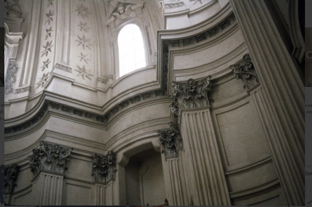
Interior of Sant’Ivo alla Sapienza
Deborah Rosenthal: Borromini, like all seventeenth-century Italian architects, used a classical vocabulary of columns, capitals, pediments, arches, and domes that dated back to ancient Greek and Roman times. But he took the stately and sometimes even static Euclidean geometry that those forms suggested to many great architects, and replaced it with a dancing, careening geometry of ovals and spirals and enigmatically torqued spaces. In seventeenth-century Rome, where churches tended to be packed with paintings and sculptures and brilliantly colored marble, Borromini favored an almost monochromatic palette that magnified his genius for reimagining classical forms as a grave and unique geometric poetry.
Jed: If Bernini’s work is what first hits you when you visit Rome, Borromini’s achievement has a way of sneaking up on you when you return and look and see more. Together their distinct but related styles – Bernini’s thunderous, Borromini’s musical – defined the dynamism of the Roman Baroque style, which influenced architects across Europe for many generations. Now, some 350 years after Borromini’s death, his work seems the more modern achievement.
Deborah: Borromini both subsumes and pushes forward the classical language.
What do I mean by this? An architect trained in the classical tradition – what used to be called the beaux arts tradition — would notice in Borromini’s work violations of those canonical forms. He forces the classical forms to undergo a transformation – sometimes by elaborating them, sometimes by paring them down. A rectilinear shape that has its edges “bitten off” emerges as a new, multi-sided, slightly curving shape. Compression applied to a form yields a new form — the most fundamental example, a circle that under pressure from the perimeter slides into an oval. I find something romantic in these idiosyncratic transformations of an ancient tradition.
Morgan: To be honest, I haven’t spent much time thinking about Borromini or looking at many Borromini designed buildings. I remember visiting the church at the Quattro Fontane in Rome when I was much younger and finding myself distinctly unimpressed and maybe even slightly annoyed at the building. It didn’t look how a church is supposed to look to me. Maybe this has something to do with learning about Borromini only in relation to Bernini, who was presented more or less as the hero, while Borromini played the strange and paranoid villain always trying to undermine the greater genius. Obviously from what you’ve already said, you don’t buy into this story. But can you say a little more about why this view of Borromini is wrong and how we should look at Borromini’s work instead?
Jed: Wow, Morgan – you’re really challenging us. Count us among the fanatical admirers of Borromini’s genius. (We need to get you back to S. Carlo alle Quatro Fontane.) But seriously — your feelings about Borromini may be too much shaped by an emphasis on head-to-head artistic rivalries that risks obscuring the richness of each artist’s achievement. We’ve certainly seen this in recent years in the books and exhibitions that have insisted on pitting Picasso and Matisse against each other. When Bernini is presented as the quintessential Baroque architect, Borromini is almost inevitably pushed into the dissident position. We’d rather see Borromini’s work as belonging to an alternate lineage and argue that Bernini and Borromini represent two distinct visions rooted in the same classical ideas. Borromini represents what might be thought of as an eccentric counter-tradition within the classical tradition. In some accounts this tradition stretches from the idiosyncratic temples of the Eastern Roman Empire (Baalbek, Petra) through the variegated columns and domes of Byzantium all the way to Antoni Gaudí’s work in fin-de-siècle Barcelona.
Deborah: Like all architects, Bernini and Borromini strive for unity, but unity means different things to them. Borromini’s unity, with its harmonious juxtaposition of disparate elements, entertains ambiguity; you don’t know what will come next. Bernini’s vision is almost triumphalist, with his pillars, pediments, and other architectural elements reaffirming the rhythms of a common theme. The Italian architect and scholar Paolo Portoghesi, in his brilliant book about Borromini published in the 1960s, addressed what we might call Borromini’s unharmonious harmonies. “For those who are accustomed to consider as irreconcilable tradition and innovation, tolerance and strictness, reason and feeling, force and tenderness, the work of Borromini is destined to remain mysterious and contradictory, since the objective of his researches was the productive synthesis of opposites, the demonstration of the substantial relativity of formal values.” Portoghesi can be said to be conceiving of Borromini as a modernist; the name of Walter Gropius, the architect who founded the Bauhaus, is invoked at the very beginning of his book. As modernists ourselves, we are attracted to this sort of artistic temperament. But of course, Borromini, like Bernini, was a product of his time; there’s no doubt that his thinking was shaped by the critical spirit of the Counter Reformation. Working for some of the most powerful figures in Papal Rome, Borromini defined a new, restrained splendor through the intellectual rigor with which he deployed the classical vocabulary. His work – like that of some of the great modernist architects, among them Gaudí and Aalto – evinces an intellectual sensuality. Bernini’s temperament suited the triumphalist Rome of the seventeenth century. Bernini’s greatest works have always been among the first things we go to see when we’re in Rome. But for us, Rome is every bit as much Borromini’s city – a city where intellectual life found deeply sensual expression.
Morgan: Well, the good news is that I find myself drawn to the Borromini you are describing. As I think you know, I have all sorts of romantic tendencies. Probably, between Bernini and Borromini I am more naturally in Borromini’s camp. I just didn’t know it until now! I do find myself intrigued and somewhat confused that you describe him as a romantic and a modernist. Maybe I see those two traditions as more in tension than you both do. Did that have anything to do with the genesis of the book you’ve created together? Jed being rather more drawn to the modernist impulses in Borromini and Deborah to the more impressionistic, wild, and romantic leanings? And if I’m completely off the mark here, how did the idea for this collaboration come about?
Jed: Maybe the best place to begin is with our title: About Borromini. We wanted the various connotations of about, which means on the subject of, in the vicinity or neighborhood of, but also gives the sense of moving around. We wanted to suggest the importance of inspiration or transformation rather than transcription. When we were at the American Academy in Rome in 2003, we ended up spending a good deal of time looking at Borromini’s work. Before that we had – like you – mostly known San Carlino. But we were curious – and we got hooked.
Deborah: As for many artists, for me looking means drawing. As we went from one Borromini site to another, I was drawing motifs and details. (Some of these drawings were ultimately used for the endpapers of our book.) In Borromini’s work I saw a different approach to geometry than I had encountered before – and I sensed that I could use it in my work.
Jed: At that point neither Deborah nor I had plans to “do” anything with Borromini. We were discovering something together, excited to simultaneously be learning about the work and exploring our responses to it.
Deborah: I want to pick up on what I’ve just referred to as Borromini’s different approach to geometry. Borromini inherits a classical vocabulary but deploys it in an un-classical – some would say almost romantic – way. He overthrows the vertical/horizontal geometry of floors, walls, ceilings, and the right angles that are key to the ensemble of a classical building. I think it was Paul Klee – a modernist who’s been essential to my thinking since I was a young painter – who once said, you have to “banish the too-reasonable horizon.” That’s what Borromini does. The power of the classical right angle comes from its origins in the experience of a human being standing upright on the horizontal earth. When we come into a room we have certain expectations. Borromini often upsets these expectations. He disrupts the rectilinear, straight-edged, gravity-determined model of an interior space that we’re accustomed to.
His ovals and spirals redefine and reanimate the way we move through space. We find ourselves thrust upward and whirled around. He has helped himself to all the classical building blocks of that stable, gravitational model: column, pilaster, pediment, window – and then he has challenged them.
Jed: People invariably point to the plainness of Borromini’s churches, which have none of the elaborate, sculpted and painted figures that dominate so many Baroque buildings, whether as complex altarpieces, painted ceilings, or trompe l’oeil effects. In entering many Baroque churches we’re invited to stand in a fixed position and look on as figures enact a spectacle for us; perhaps the best known – and most extreme case – is Andrea Pozzo’s elaborate perspectival ceiling in the Church of the Gesù in Rome.
Deborah: Borromini does away with all that. He denies us the interactions with painted and sculpted figures that parallel our interactions with other people in the world. In Borromini’s Church of S. Ivo della Sapienza the entire interior is wrapped in an ensemble of spirals, ovals, and hexagons – and we’re left alone with the dome. Looking up, we find that we’ve abandoned any reasonable horizon line. Our feet leave the ground. There is something here of Rimbaud’s “systematic derangement of the senses.” I think Jed was suggesting this experience with a concatenation of images in About Borromini: “stars, zigzags, angles, angels, ovals, edges, curls, curves, flames, flowers, shells, breaks, bursts, echoes, accents, repetitions, reversals, reunions.” I don’t think that the rush of space that I feel envelopes me in S. Ivo is all that different from the space in a modern abstraction, for instance Robert Delaunay’s Simultaneous Contrasts: Sun and Moon (1913). In many modern paintings there’s no regular system of measurement (such as one-point perspective) being applied to determine the distance between the viewer and the shapes and forms in the painting. In a perspectival space the viewer’s position is fixed. The rejection of a perspectival construct pushes the viewer into new, perhaps more active engagement with space. It’s a kind of space I aim to construct in my paintings.
Jed: From Deborah’s remarks, I think it’s clear that for us modernism, romanticism, and maybe even impressionism are fluid, interconnected ideas and ideals. Maybe even interchangeable. Over the years I’ve come to feel that the many-faceted phenomenon we refer to as modernism would more profitably be thought of as symbolism – not symbolism in the limited sense of a late-nineteenth century movement but symbolism writ large, as the freedom to invent a personal iconography of signs and symbols that might be romantic or classical or some of both. Borromini is very much a part of this lineage – a kind of proto-symbolist. Paul Klee, whom Deborah just mentioned, can only be understood as this kind of symbolist. I think the same can be said of many different kinds of modern artists, certainly of Brancusi, Picasso, even Balthus.
Deborah: Although About Borromini only began to come into focus some years after we left Rome, the conversations we had in Rome gave us new opportunities to explore questions of tradition and innovation that had obsessed us for some thirty years. Back from Rome, I found myself returning to printmaking; I’d been preoccupied with etching and engraving in my early twenties. The physicality of cutting into linoleum or incising a copper plate to make a print suggested analogies with the carvings in Borromini’s architecture. And the black-and-white that I have always favored as a printmaker jibed, I think, with the austerity of Borromini’s architecture, which largely eschewed the colored marble, polychrome, gilding, and oil paintings that dominate so much Baroque architecture.
Jed: Around the same time, after completing my book New Art City, a panoramic, fact-filled history of art and culture in mid-twentieth-century Manhattan, I was experimenting with a spare and rather subjective kind of writing in Antoine’s Alphabet. This is a book with a highly idiosyncratic structure, a series of stories, reflections, metaphors, and anecdotes organized alphabetically, many with only a tangential relationship with the book’s subject, the eighteenth-century painter Antoine Watteau. I suppose you could say that both Deborah and I were responding in a very personal way to the work of a great master of the past, whether Borromini or Watteau. When there was a possibility of exhibiting some of Deborah’s prints, it seemed natural for me to join in, which meant responding simultaneously to our experience of Borromini and to Deborah’s Borrominean metaphors. I think it’s fair to say that Deborah’s work in About Borromini is more elliptical and improvisational than her paintings. I think I was aiming for something similarly elliptical and improvisational in my texts; I sometimes describe them as prose poems. There’s an element of jazz improvisation in About Borromini – riffs and variations on the songs that Borromini sings.
Deborah: Both of us are romantics, classicists, and symbolists – which I suppose makes us modernists!
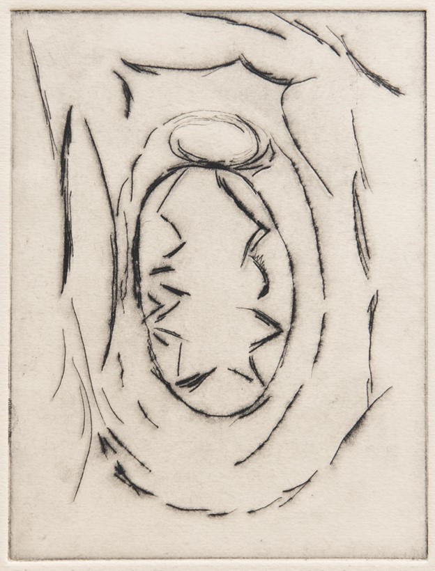
Morgan: Amazing. I love what you’ve both said here. I’m curious now about the organization of the book. On alternating double pages, an artwork by Deborah is followed by a text by Jed. Window, for instance, a lovely drypoint/engraving by Deborah, precedes a text by Jed that includes a phrase that I love: “They’re drum rolls for oblivion, fanfares for nothingness.” Are the image and text in dialogue with each other, or are these your own separate responses to what Borromini does with windows?
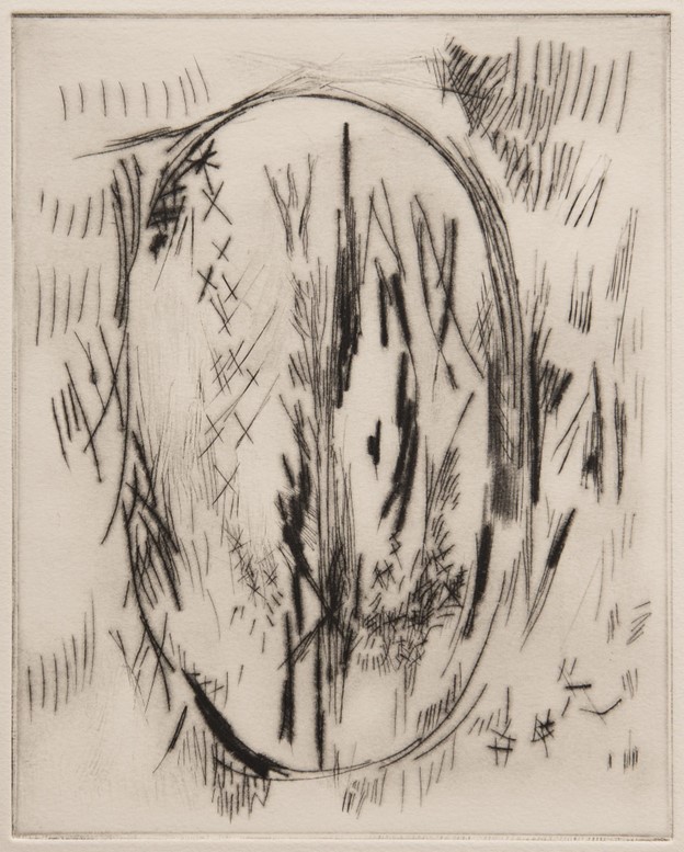
Deborah Ronsenthal, Window (2007)
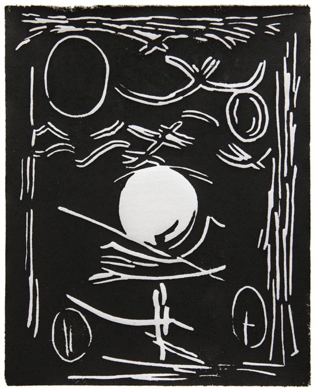
Jed: I’m interested in your question about the interaction between image and text – about the kind of dialogue we want the book to be. We see the book as presenting two independent voices responding to some of the same experiences and emotions, and at times running parallel, at other times converging or diverging. The design of the book reflects this. Our work is together between covers, but images and texts are on separate double-page spreads. Sometimes, as you observed, a text touches on a particular print – as you mention in the case of the print entitled Window and a text that follows it. At other times we’ve intentionally juxtaposed a text and a print that seem more distantly related. And sometimes – as when the print Graffiti is preceded by the text that begins “Stars, zigzags, angles, angels…” – there’s a shared rhythm. We put together prints and prose as a sort of duet.
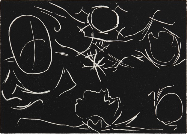
Deborah Rosenthal, Graffiti (2005)
Deborah: Jed and I came back from our stay in Rome in the spring of 2003 with heads full of Borromini. I had a sketchbook of drawings I’d done while looking at Borromini’s work. What interested me were particular architectural configurations and details. I’ve always described myself as a metaphoric abstractionist – and those metaphors have at certain times involved elements of figure and landscape. The experience of Borromini was pulling me back to a more purely abstract language. (Borromini’s own architectural drawings can be regarded as beautiful abstractions.) For me printmaking, which I did at the beginning of my career, has always been in some fundamental way an exploration of black and white. Thinking back on it now, it seems logical that I turned to a graphic medium in response to Borromini, who almost invariably eschewed color in his architecture. The cutting and incising involved in printmaking formed a kind of parallel – a kind of sensual correspondence – to the carved stone surfaces of Borromini’s buildings. It was only later that some of Borromini’s motifs entered my paintings.
Jed: As I said before, I was working on my book Antoine’s Alphabet as this series of prints began to emerge from Deborah’s studio. I found myself wondering whether it might be possible for us to do something together. Prints and prose and poetry have always gone together. Deborah and I had long been fascinated by the collaborations of Sonia Delaunay and Blaise Cendrars and Jean Arp and Sophie Taeuber-Arp – as well as more generally the livres d’artiste produced in Europe in the nineteenth and twentieth centuries by Matisse, Picasso, Dufy, and countless other artists.
Deborah: One of the interesting aspects of many of the livres d’artiste is that the relationship between image and text is open-ended if not elusive. Something similar is true of our work for About Borromini. The images do not illustrate the texts — nor do the texts explain the images. The book is a study in counterpoint.
Morgan: Thanks. That’s a great explanation of what’s going on in the book. Given my increasing understanding, thanks to both of you, of what Borromini was up to, I suspect this is exactly the kind of book he himself would have appreciated. At the risk of destroying the mystery and the elusive/allusive nature of your book, I was especially intrigued by Deborah’s drypoint entitled Diana of Ephesus. Diana/Artemis has been a minor obsession of mine for some time and I’m curious as to how Borromini fits in. I’m also trying to figure out how the Diana of Ephesus theme sent you, Jed, into thoughts about books and libraries. You write, “I find it fascinating that among the loveliest interiors created by this prickly, bookish architect are libraries.” Would it be possible to strengthen a few of these connections without breaking the spell?
Deborah Rosenthal, Diana of Ephesus (2007)
Deborah: You’re tapping into the about part of About Borromini. That about (as in around or round about) extends from the trove of images and associations that Borromini embraced, to our images and associations three hundred years later. Morgan — I love that you’re asking about Diana of Ephesus – because that interest in unexpected linkages, parallels, and echoes is part of what I think is so terrific in your books about Rubens and Franz Marc. There’s a sense in which art is all about echoes and affinities. I first found myself thinking about Diana of Ephesus after seeing a sculpture of the goddess in – I think – the Capitoline Museum in Rome way back in 1980. From this sculpted figure with breasts covering her body from head to toe I derived a pointed rhythmic contour that for me is what the French call a sign, an image with several meanings – in this case an exaggerated contour of femaleness that simultaneously echoes the juxtaposed silhouettes of a Borromini dome. By juxtaposing a figural association and an architectural association I’m suggesting a connection between (female) bodily space and architectural space. The image of Diana is also sort of funny – it has a ridiculous aspect. Borromini sometimes risks ridiculousness.
Jed: I suppose that the more we talk the more elusive and allusive we get. Diana of Ephesus didn’t send me to books and libraries – but, yes, Deborah’s multiplying allusions suggest the multiplying associations we find while browsing in books and libraries. Deborah just reminded me of something that she used to say to painting students: “You have to look at the source of your sources.” Part of the fascination of great artists, whether Borromini or Titian or Picasso, is that their sources are deep and wide – as in a library, you can browse among them. When I referred to the “deliciously shaped shelves” in a library designed by Borromini I was suggesting a sort of erotics of the book. Which brings us back to the first image in About Borromini, Frontis/Façade —
Deborah Rosenthal, Frontis/Façade (2007)
Deborah: — which conflates the beginning of a book with the façade of a building. Maybe About Borromini is about the erotics of architecture.
Morgan: Thanks, that was a fun ride. It’s interesting that in regards to the Diana of Ephesus material, I would have guessed something similar to what you’ve both described. Score one for the deep power of that which is elusive/allusive! Let’s try one more of these and then we can wrap things up. I’ve found myself looking at Deborah’s work Twisted Column a number of times. Something figurative keeps emerging and then disappearing again whenever I try to nail it down. And then Jed’s text evokes something of the same feeling when he describes Deborah’s images as being “skeletal emblems.” Could you dig into these words and images a bit more for us, please?
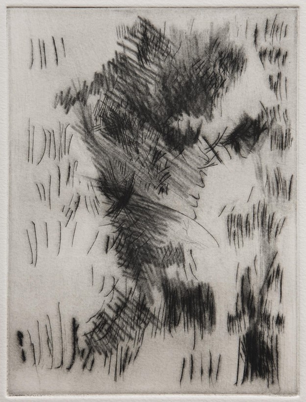
Deborah Rosenthal, Twisted Column (2007)
Deborah: To make a generalization…if Renaissance architecture (think of Brunelleschi) was about nailing everything down, then Baroque architecture was about refusing to nail it down. Borromini and Bernini want things to spiral, gyrate — fly off or even dissolve. My primary sensation while working on Twisted Column was a kind of desperation to borrow the dynamism of a Baroque spiral – to make a print that suggested that force, rather than describing a specific physical entity. In Twisted Column I set that revolt against stability against the more regular rhythms of short verticals which frame the central action. These bundles of small vertical lines – a few in groups of five plus various larger groups — refer to the fluting on a column. All columns have figural associations; it occurs to me that the fluting may suggest musculature (among other things). The Greeks made the association between the column and the figure explicit with their caryatids. The twisted column, with its muscular verve, sets the figure into motion. That may be why Bernini used twisted columns for the Baldachino in St. Peter’s – surely the quintessential example of the twisted column in Baroque Rome. Borromini, at least in his most important buildings, doesn’t seem to use the twisted column. For Borromini the generative impulse seems geometric, while for Bernini — who was, first and last, a figure sculptor — the generative impulse comes from the body.
Jed: Whether or not we’ve succeeded, we’ve set out to do something rather radical. I find it interesting that you’ve responded to Deborah’s Twisted Column, one of the rawest images in the book. With About Borromini we’ve presented tradition not as a smooth development but a matter of leaps and ruptures between then and now. We believe that you must meet the past with immediacy – a kind of rawness. The Baroque artists, architects, and writers were obsessed with emblems. What is an emblem? An emblem is a metaphor which packs volatile images and ideas in a singular form. The ornamentation on a building or the floor plan of a building or the shape of a dome can be emblematic – and generally was when the architect was Borromini or Bernini. We’ve found ourselves unpacking these emblems. That’s led us, sometimes, to skeletal emblems. Or – to put it another way — deconstructed emblems. The idea of deconstruction isn’t entirely unrelated to the idea of destructive – an idea Mondrian, Picasso, and Miró invoked when they spoke about the “destructive” element in their practice. Their statements are all too often seen as a rejection of tradition, when in fact a certain destructive impulse enables an artist to crack open and thus affirm the past. In this sense we are both traditionalists – destructive/constructive traditionalists. To the extent that About Borromini involves unraveling Borromini, it’s because we’re here now – looking at the past with modern eyes.
Morgan: Another wonderful response. I love the idea of Borromini wanting things to gyrate, Deborah. You definitely captured that in your own art. I think we are done! Thank you for doing this and for allowing me to work through my skepticism or even slight hostility regarding Borromini. I suspect I am a slightly better person for the experience and for exploring more deeply your beautiful book.