Down through the layers: the paintings of Mark Bradford
For at least a decade now there’s been a buzz about Mark Bradford. People call him an exciting painter. Those two words, “exciting” and “painting,” don’t get put together very often, which is understandable. There is something about painting that promotes a reflective attitude. You look at a painting by standing your distance and contemplating. You can like a painting, love a painting, even be moved by a painting. But excitement? Not so much. What is it about Bradford’s paintings that makes them exciting? The answer, I think, is that Bradford has discovered an approach to abstraction that’s genuinely fresh, genuinely new. No one’s done it quite like this before.
So, let’s get right down to describing what Mark Bradford does when making a painting: He collects stuff. Much of the time, this happens in the city of Los Angeles. Bradford drives around LA, generally close to his neighborhood in South Central, (where he grew up) but ranging wider as the need may be. Born in 1961, he was, beginning as a child, and off and on for years, an assistant in his mother’s hair salon in Leimert Park. After high school, he got himself licensed as a hairdresser so he could work in the shop full time. It was not until Bradford was thirty years old that he entered into any formal art training. He went to CalArts in 1991 and emerged with an MFA in 1997. Twelve years later he picked up a MacArthur “Genius” Award for his paintings and, in 2014, a US Department of State’s Medal of Arts. His paintings currently sell in the two to fifteen million dollar range on the international market. The sticker price is amazing in itself but even more so because his works are physically huge and therefore unwieldy for the collector. Not bad for a late starter.
But let’s get back to Mark, driving around LA looking for interesting material. Bradford stops whenever he sees posters or flyers or handouts or any other cheap graphic material that collects around telephone poles, spots alongside liquor stores where people post such things, bus stops. He grabs what he likes and he grabs a lot of it. Then, he takes that material back to his studio.
Bradford is not a painter of the paint brush. He is a ‘painter’ of the glue pot and the palm sander. He slops and sticks and glops and accretes and then rips and tears and sands and effaces. He might daub some paint onto the canvas here and there, but there is very little of the traditional brushstroke in his work. He makes few marks. Instead, he builds up a surface from the accumulation of all the raw material he’s collected, and then he whittles away at that accumulation until he’s reached a final product that feels right to him.
Bradford ‘paints’ by layering as many things that are ‘not-painting’ onto the surface as he can, and then scouring and removing that material until the thing that is not a painting turns, as if by magic, into something that starts to look and feel more or less like a painting.
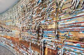
To see what I mean, let’s look for a minute at Helter Skelter I (2007), which has become perhaps Mark Bradford’s most celebrated painting after it sold for around twelve million dollars last year. That sale, by the way, put Bradford in the uppermost tier, price-wise, of artists on the planet today. It was also the highest-ever auction price for a living African American artist.
(Helter Skelter I, 2017)
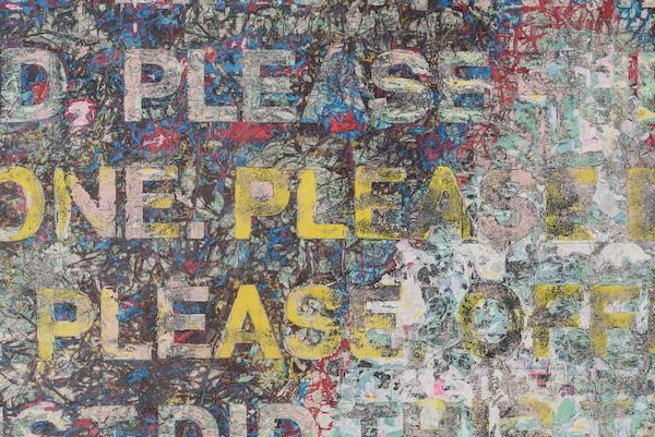
In catalogs, Helter Skelter I is described, rather laconically, as a “mixed media collage on canvas.” Sure it’s mixed media, but what a mix! The question is less what Helter Skelter I is made of and more what’s it not made of. Besides the aforementioned scraps of paper, flyers, handouts, and bills, it’s also got bits of tinfoil and areas of paint. There is string on the canvas and there is caulk on the canvas. I should also mention that the painting is about thirty-two feet long and twelve feet tall.
Helter Skelter I looks almost topographical from a distance. A map of something-though it is unclear what. Close up, the scene is chaotic. Fragments of text and found images emerge from the mess of other materials.
(Helter Skelter I, detail)
The phrase ‘helter skelter” is, of course, famous because Charles Manson plucked it out of a Beatles song and turned it into a rallying cry for his vision of an apocalyptic race war. This race war was precisely what the Manson “Family” were trying to usher into being with their various shocking murders in the late 60s. But what, exactly, does Bradford’s painting have to do – if anything – with this traumatic historical material?
The painting is not commentary, exactly. It doesn’t say anything specific about Charles Manson or American race wars. Instead, the painting is a work of art generated from Helter Skelter. Let’s look at another painting to understand better what it means that Bradford generates abstract art from life.
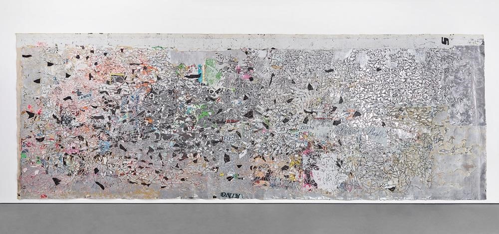
(Pickett’s Charge, 2017)
The painting is a recent work called Pickett’s Charge (2017). Another huge painting composed of eight interconnected panels, it is more than four hundred feet long in total and takes up the entire third level inner gallery of the Hirshhorn Museum in Washington DC. Pickett’s Charge references a ‘cyclorama’ made by a French artist in the 19th century. It tells the story of Major General Pickett’s famous charge at the battle of Gettysburg. The original cyclorama can be seen at the Gettysburg National Military Park in Pennsylvania. Nothing other than the title of Bradford’s Pickett’s Charge would, at first glance, reveal this fact. Instead, the painting looks more like a formal study of a series of colorful lines as they flow and intersect around a circular space.
Taking a slightly closer look, there is, as in Helter Skelter I, a topographical feeling to the work. Is it a portrayal of geological time as in those cliffs out in Arizona where one can see hundreds of millions of years of earth and rock layered one on top of the other? Further inspection reveals that the entire work is composed mostly of paper, layers and layers of colored paper stuck together and then ripped apart again-torn, shredded, reconstituted, woven through with string and other bits of hard to identify matter. And then, hidden within that, are some of the images and figures of the original cyclorama of Pickett’s Charge, images that Bradford reproduced and then mulched up to varying degrees as material for his own work.
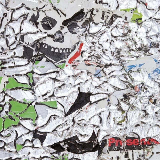
(Pickett’s Charge, detail)
Pickett’s charge is, of course, one of the more ‘meaningful’ points in American history. The charge came at a climactic moment during the Battle of Gettysburg. Had the charge been successful, who knows? Robert E. Lee’s Confederate army might have gone on to win the Civil War. When Pickett made his famous charge, the outcome of the Civil War hung in the balance. The history of American slavery hung in the balance. The fate of the South hung in the balance. And because of the ultimate futility of the charge, a sense of doomed romanticism has settled around it. It is the dying gasp of an essentially pre-modern form of martial heroism, the American equivalent, as it were, of the Brits and the Charge of the Light Brigade.
The charge has always therefore been the symbol of strange, tense, and ambivalent nostalgia about an antebellum US. Ambivalent because it is difficult to consider Pickett’s Charge without feelings of disgust at the utter carnage of the war. It is difficult to consider the charge without also feeling a sense of bafflement and shame that the liberty of millions of African Americans is being determined by a cavalry charge. So, for many Americans, when it comes to Pickett’s Charge, there is both a vague sense of honor and a vague sense of shame. It is impossible to sort out the complexity of thoughts and emotions and historical memories that draw like a whirlpool around the centripetal force that is Pickett’s Charge.
Bradford took all of this content and then tore it apart. He made from it a work of art. Art: something that has aesthetic value for the sheer fact of what it does to the senses, here primarily the eyes. One can appreciate Bradford’s work simply for the way it tackles the problem of a circular room. How do you make a work that maintains itself visually for more than four hundred feet of space-space that, moreover, reconnects to itself once the circle is complete? To solve this formal problem, Bradford made an artwork of shape and color and flow that manages to be continuous and continuously interesting all the way around a vast circle. It changes hue and tint, tone and shade, and sometimes seems to pause and break. It has gaps and shifts. It slumps down at moments and then gathers steam and makes its way around the room again. The work is a formal solution to a formal problem.

(Pickett’s Charge, detail)
But it is also Pickett’s Charge. The history doesn’t go away. The tragedy and the pathos don’t go away. This isn’t just a formal loop of line and color. It’s a loop that reaches into the hardest and most intractable realities of American history.

(Pickett’s Charge, detail)
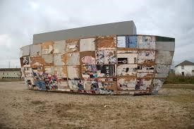
There’s a temptation among critics to say, on finally unearthing the content, “Ah ha, here’s what the work was really about all along. Here’s what it means!” That’s the attempt to decode the work, to find the message buried within. But there is no code. Pickett’s Charge does not have a message to tell us about Pickett’s Charge. It’s the other way around. The point is that Pickett’s Charge is so deeply meaningful, so tremendously powerful a moment in American history that art must take it up. It must be the matter from which art is made. Art cannot leave it alone, must not. Just as art cannot and must not neglect the flyers and printed matter of South Central Los Angeles. Just as art cannot and must not shy away from any of life’s tragedies and traumas. It is not surprising at all to hear that, after Hurricane Katrina, Mark Bradford went down to New Orleans and built an “ark” in the Lower Ninth Ward and covered that ark with all his typically worked-over paper ephemera. The structure itself is part shipping container, part steel, part plywood. The rest is material, graphic and otherwise, scavenged from neighborhoods in New Orleans. It’s less a piece about the catastrophe in New Orleans, and more a tattered remnant of the actual event. A physical reminder of Hurricane Katrina that now travels the world from art fair to art fair.
(Mithra, 2008)
The issue of meaning in Bradford’s paintings is thus complex. It’s not that his paintings are ‘about’ being black or gay or from a specific and notoriously ‘inner city’ neighborhood. His paintings are not ‘about’ identity. They don’t make a statement about identity. But they don’t run away from it either.
Mark Bradford’s paintings and other artworks take up historical content; they take up difficult matters of race and class, of culture and sexuality. But they take up that content through the formalizing techniques of collage and abstraction. The normal process of making a collage is to combine a bunch of content into new forms and new content. The content multiplies, the associations multiply. Bradford does something different. He makes collage by grinding the content down. This lets the formal elements of the material take on new shapes and forms and plays of color and design trapped within, and often buried beneath, the content. The inherent meaning of the original content is thus stripped away, at least to some degree. The danger and excitement of Bradford’s work is that he grabs so much hot and heavy stuff from the world and then cools it out, lays it down, buries it and subsumes it. It is quite bold, really. Who else would have the courage to handle such inherently meaningful material and then, in a sense, let it go? To threaten effacing the meaning almost entirely? He takes his rich raw material and then tames it, experimenting with how a million bits of historical hot stuff can be condensed down into one little area of lumpy and interesting ‘paint’ surface, or a playful run of lines and shapes across the bottom of a canvas.
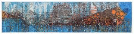
(Deep Blue, 2018)
The word ’abstract’ comes from the Latin verb abstrahere, to draw away. Something that is abstractus (abstracted) is something that has been reduced. It has had something removed, leached out of it, and thus been distilled into a purer state of being.
In this sense, Bradford’s work is as fundamentally, literally, abstract as any painting in the last hundred and twenty years. A flyer from the streets of LA can be experienced simply as an interesting and pleasing swirl of colors, shapes, and lines. Bradford has quite a good eye for what makes a canvas visually stimulating. Perhaps this comes from the years in his mother’s beauty shop. He likes pleasing undulations of line so much, it is hard not to imagine him standing above a particularly luscious head of hair and treating that hair more or less how he treats a canvas.
But as a hairdresser, you’d never want to forget that, beneath the waves and shine and flow of all that hair, is an actual person. In Bradford’s case, usually a black woman of the Leimert Park area of South Central Los Angeles. The content matters. It sure as hell matters when you are doing someone’s hair (Is this what she wants, will it look good, will she be happy?). By extension, it matters with Mark Bradford’s paintings. The printed matter that Bradford collects in LA speaks volumes about the actual lives of people. These are flyers offering people ‘good’ jobs, or cheap credit, bankruptcy help or any other imaginable service in the grey economy that thrives just at the cusp of legitimacy – in Los Angeles and in every other big city on earth. One of Bradford’s earlier works (Untitled, 2006) is a canvas that found its origin in a flyer boldly printed with the words “IS THIS CHILD YOURS? DNA TESTING.” There are scraps of other flyers and bits of printed paper also preserved on the canvas, and the letters of the original flyer have been scanned and re-copied, and slightly effaced through all manner of procedure, not unlike the process through which Jasper Johns will take an original image and then copy it, silkscreen it, repaint the silkscreen, photograph that, and so forth. Untitled has been put through the aesthetic wringer in more ways than one.
The words, however, can still clearly be read. All the troubles of people’s lives exist on the canvas, both in the words and in their aesthetic transformation. The lines of print against the smudgy white background of Untitled (2006) are satisfying in purely formal terms. And yet, aesthetics can’t ever be pure. Bradford’s paintings wiggle back and forth on that tense razor’s edge where the intense and often socially explosive nature of the paintings’ content always threatens to disrupt the aesthetic space of the canvas. At the same time, the pleasing aesthetic unity of his finished canvases are just at the edge of hiding or completely obscuring the electric raw material that brought these canvases into being. Bradford’s work is powerful because these two forces are in conflict, the from-a-distance aesthetic effect versus the freighted social meaning of his raw materials. He uses that conflict productively. Form and the content are battling it out right there on the canvas, right before your eyes.
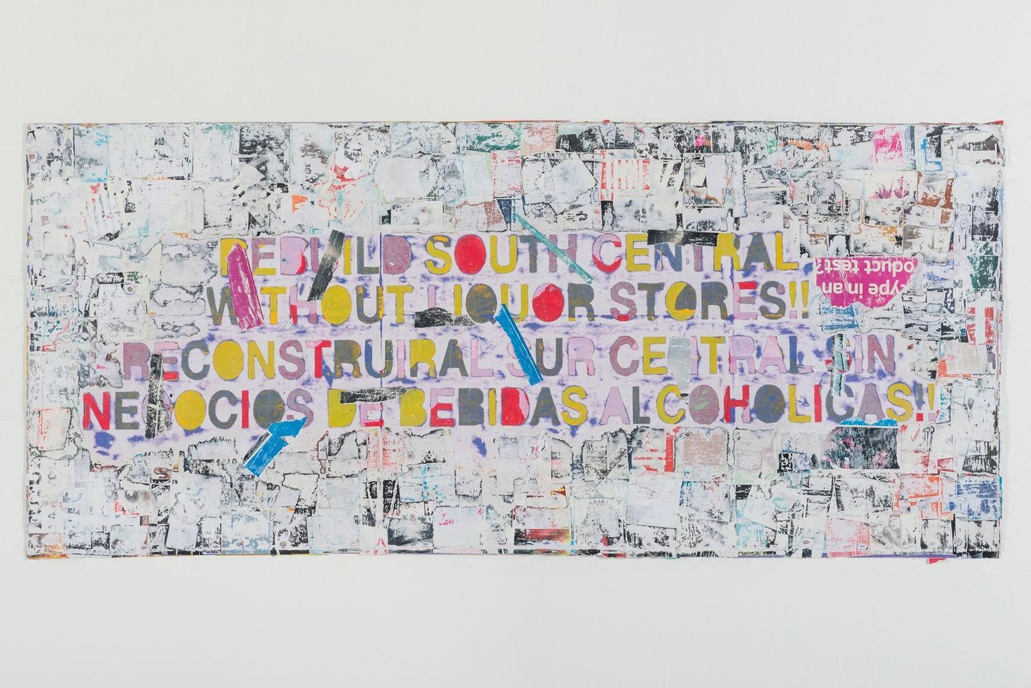
(Rebuild South Central, 2015)
The mistake, in looking at Mark Bradford’s work, is to think that one or the other side of this conflict must finally win out. Throughout the 20th century, being associated with abstraction meant, more often than not, rooting for the victory of form. The whole point of making abstract art was to get rid of the specific content. One thinks, for instance, of Piet Mondrian, the De Stijl (‘The Style’ in Dutch) movement, and the various statements and manifestos declaring the ultimate aims of neo-plasticism. Here is a typical thought from Mondrian’s 1920’s essay “Neo-Plasticism in Pictorial Art.”
The new plastic idea cannot therefore take the form of a natural or concrete representation – this new plastic idea will ignore the particulars of appearance, that is to say, natural form and colour. On the contrary it should find its expression in the abstraction of form and colour, that is to say, in the straight line and the clearly defined primary colour.
Mondrian’s classic paintings of pure color and line were produced by taking the most basic elements of a landscape or a still life, and getting rid of everything directly representational, everything but the basic building blocks of orientation, primary color, pure line. They are abstractions, but they are abstractions of the mind. They have broken all ties with any particular landscape in, say, the Netherlands in the early 20th century. A painting might be called Place de la Concorde 1943, yet you can’t look at this painting and locate the Parisian scene from which the painting is abstracting.
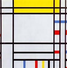
(Place de la Concorde, 1938-43)
This, I think, gets at the real reason the art world is excited about Mark Bradford. His work is fascinating from the perspective of abstraction because we know exactly and precisely what it abstracts from. We know because the actual stuff they are abstracting from is right there on the canvas. And the techniques Bradford uses to abstract are just as contentful, just as symbolic: sanding, tearing, scraping, layering, peeling. His work of abstraction is not primarily conceptual as it is in a Mondrian work because, in a Bradford painting, the content never really goes away. And yet, it is being made to disappear, at least to some degree. Bradford is very aware of the fact that he is destroying this powerful content in order to make it art.
It is hard to come up with another example in the history of abstract art that so honestly and painfully and movingly documents this deeply troubling but also deeply satisfying process. In Bradford’s work, it is as if we have to destroy meaning in order for us to care about it in a new and different way. And the painting, the thing we care about in a new way, in an aesthetic way, has to contain all the reminders, all the traces that made us care about it in the first place. This is abstraction with all its wounds and trauma laid bare. This is work that refuses to turn its back on life just as resolutely as it refuses to turn its back on art.